How to use button group or group of buttons in Bootstrap 4 :
Button-group or group of buttons can be created in bootstrap easily. Bootstrap comes with one inbuilt class called btn-group for displaying buttons in groups. We can create vertical or horizontal groups with different types of buttons. In this tutorial, we will mainly learn how to create button groups using bootstrap 4. We will post the full html file code below that you can copy into any .html file and check the result. Let’s take a look :
Using a simple group of buttons :
As mentioned previously, we need to put the buttons inside a btn-group class to achieve the result. For example :
<div class="btn-group" role="group" aria-label="Group of buttons">
    <button type="button" class="btn btn-primary">Primary</button>
    <button type="button" class="btn btn-secondary">Secondary</button>
    <button type="button" class="btn btn-info">Info</button>
    <button type="button" class="btn btn-success">Success</button>
    <button type="button" class="btn btn-danger">Danger</button>
    <button type="button" class="btn btn-warning">Warning</button>
</div>
One thing you should note that we are also providing role and aria-label along with the class name. It is required to support assistive technologies. It will produce one output like below :

<!DOCTYPE html>
<html lang="en">

<head>
    <link rel="stylesheet" href="https://stackpath.bootstrapcdn.com/bootstrap/4.1.3/css/bootstrap.min.css" integrity="sha384-MCw98/SFnGE8fJT3GXwEOngsV7Zt27NXFoaoApmYm81iuXoPkFOJwJ8ERdknLPMO"
        crossorigin="anonymous">
    <meta charset="UTF-8">
    <title>Document</title>
    <style>
        body {
            margin-top: 20%;
            margin-left: 30%;
        }
    </style>
</head>

<body>
    <div class="btn-group" role="group" aria-label="Group of buttons">
        <button type="button" class="btn btn-primary">Primary</button>
        <button type="button" class="btn btn-secondary">Secondary</button>
        <button type="button" class="btn btn-info">Info</button>
        <button type="button" class="btn btn-success">Success</button>
        <button type="button" class="btn btn-danger">Danger</button>
        <button type="button" class="btn btn-warning">Warning</button>
    </div>

    <script src="https://code.jquery.com/jquery-3.3.1.slim.min.js" integrity="sha384-q8i/X+965DzO0rT7abK41JStQIAqVgRVzpbzo5smXKp4YfRvH+8abtTE1Pi6jizo"
        crossorigin="anonymous"></script>
    <script src="https://cdnjs.cloudflare.com/ajax/libs/popper.js/1.14.3/umd/popper.min.js" integrity="sha384-ZMP7rVo3mIykV+2+9J3UJ46jBk0WLaUAdn689aCwoqbBJiSnjAK/l8WvCWPIPm49"
        crossorigin="anonymous"></script>
    <script src="https://stackpath.bootstrapcdn.com/bootstrap/4.1.3/js/bootstrap.min.js" integrity="sha384-ChfqqxuZUCnJSK3+MXmPNIyE6ZbWh2IMqE241rYiqJxyMiZ6OW/JmZQ5stwEULTy"
        crossorigin="anonymous"></script>
</body>

</html>
You can use the same html code for all examples we are showing below. Just change the body part to check the changes. Here, we are using Bootstrap 4.1.3. You can check the latest version on their site and change the link on the above example to check the latest version.
Using different sized buttons in a group :
For using different button sizes in a btn-group, we don’t need to declare the size for each buttons separately. Just add .btn-group-* to the button group class. That’s it. For example :
<body>
    <div class="btn-group-sm" role="group" aria-label="Group of buttons">
        <button type="button" class="btn btn-primary">Primary</button>
        <button type="button" class="btn btn-secondary">Secondary</button>
        <button type="button" class="btn btn-info">Info</button>
        <button type="button" class="btn btn-success">Success</button>
        <button type="button" class="btn btn-danger">Danger</button>
        <button type="button" class="btn btn-warning">Warning</button>
    </div>
</body>
It will produce the following output :

Using group buttons in toolbar :
We can also put button groups in a toolbar. We can also mix button groups with input group in a toolbar. Similarly, we can add different margins to these groups :
<div class="btn-toolbar" role="toolbar" aria-label="Toolbar with groups">
    <div class="btn-group mr-5" role="group" aria-label="Group 1">
        <button type="button" class="btn btn-primary">Primary</button>
        <button type="button" class="btn btn-secondary">Secondary</button>
        <button type="button" class="btn btn-info">Info</button>
    </div>
    <div class="btn-group" role="group" aria-label="Group 2">
        <button type="button" class="btn btn-success">Success</button>
        <button type="button" class="btn btn-danger">Danger</button>
        <button type="button" class="btn btn-warning">Warning</button>
    </div>
</div>
It will give the below output :

Dropdown buttons :
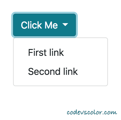
For creating a dropdown buttons, we can place one button and one dropdown-menu inside a btn-group. Like :
<div class="btn-group" role="group">
    <button id="buttonGroupDropdown" type="button" class="btn btn-info dropdown-toggle" data-toggle="dropdown">
        Click Me
    </button>
    <div class="dropdown-menu" aria-labelledby="buttonGroupDropdown">
        <a class="dropdown-item" href="#">First link</a>
        <a class="dropdown-item" href="#">Second link</a>
    </div>
</div>
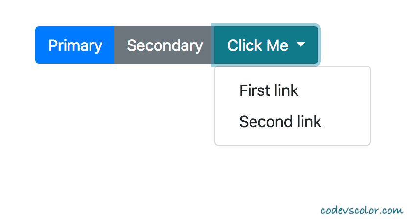
Similarly, we can place this dropdown button with other buttons in a group. This is also called nested group of buttons.
<div class="btn-group" role="group">
    <button type="button" class="btn btn-primary">Primary</button>
    <button type="button" class="btn btn-secondary">Secondary</button>
    <div class="btn-group" role="group">
        <button id="buttonGroupDropdown" type="button" class="btn btn-info dropdown-toggle" data-toggle="dropdown">
            Click Me
        </button>
        <div class="dropdown-menu" aria-labelledby="buttonGroupDropdown">
            <a class="dropdown-item" href="#">First link</a>
            <a class="dropdown-item" href="#">Second link</a>
        </div>
    </div>
</div>Using button groups vertically :
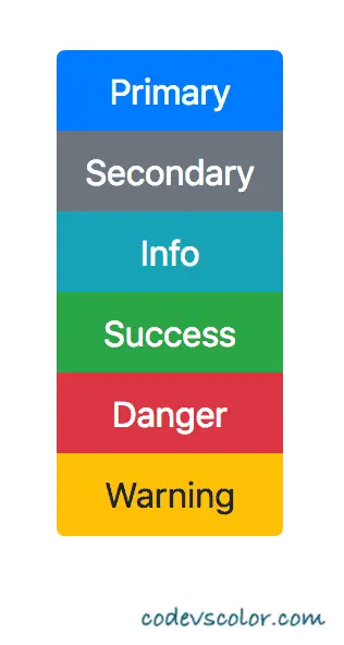
For button groups vertically, we need to use btn-group-vertical class. That’s it.
<div class="btn-group-vertical" role="group" aria-label="Group of buttons">
    <button type="button" class="btn btn-primary">Primary</button>
    <button type="button" class="btn btn-secondary">Secondary</button>
    <button type="button" class="btn btn-info">Info</button>
    <button type="button" class="btn btn-success">Success</button>
    <button type="button" class="btn btn-danger">Danger</button>
    <button type="button" class="btn btn-warning">Warning</button>
</div>Conclusion :
In this tutorial, we have learnt how to implement button group and different ways to group buttons in Bootstrap 4. Try the above examples on your system and drop a comment below if you have any queries.


