Python Matplotlib horizontal histogram:
Horizontal histogram or horizontal bar graph can be created by using Matplotlib. Horizontal bar chart shows bars parallel to the X axis. In this post, I will show you how to draw a horizontal histogram or bar chart in Python Matplotlib with different examples.
We will learn how to create a basic horizontal histogram, how to create histogram with pandas and how to create multiple bars using pandas.
Example 1: Basic horizontal histogram:
Let’s create a basic horizontal histogram with matplotlib:
import matplotlib.pyplot as plt

vehicles = ['Car', 'Bike', 'Cycle', 'Others']
count = [100, 450, 500, 1200]

plt.barh(vehicles, count)
plt.ylabel('Vehicles')
plt.xlabel('Counts')
plt.title('Vehicles count')
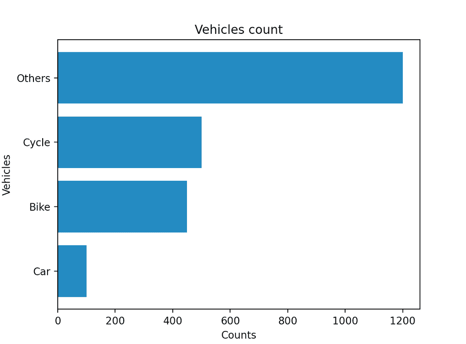
plt.show()- It uses two lists to draw the horizontal bars, vehicles and count.
- ylabel and xlabel methods are used to give labels to the Y and X axis.
- title method gives a title to the chart.
- show() method shows the bar chart.
If you run this program, it will show you the below histogram:
Example 2: Using with pandas:
We can use it with pandas as well. Let’s write the above program using pandas:
import matplotlib.pyplot as plt
import pandas

vehicles = ['Car', 'Bike', 'Cycle', 'Others']
count = [100, 450, 500, 1200]

chart_data = {'Vehicle Count': count}
data_frame = pandas.DataFrame(
    chart_data, columns=['Vehicle Count'], index=vehicles)

data_frame.plot.barh()

plt.ylabel('Vehicles')
plt.xlabel('Counts')
plt.title('Vehicles count')
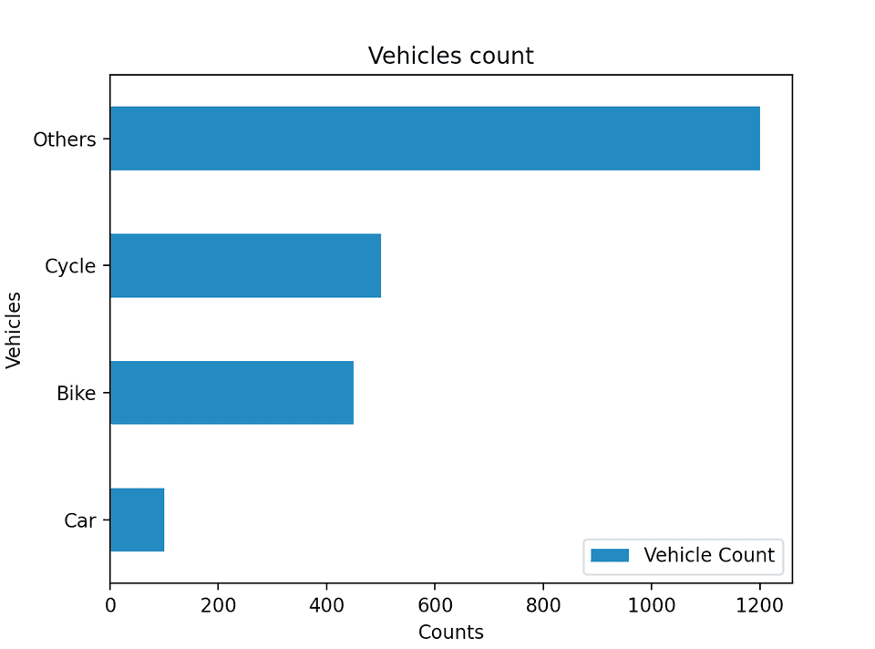
plt.show()- This is almost similar to the above program. The only difference is that we are creating a DataFrame with pandas and calling the barh() method on plot of data frame that is created.
If you run this program, it will show the below chart:
Example 3: Multiple bars for each category using pandas:
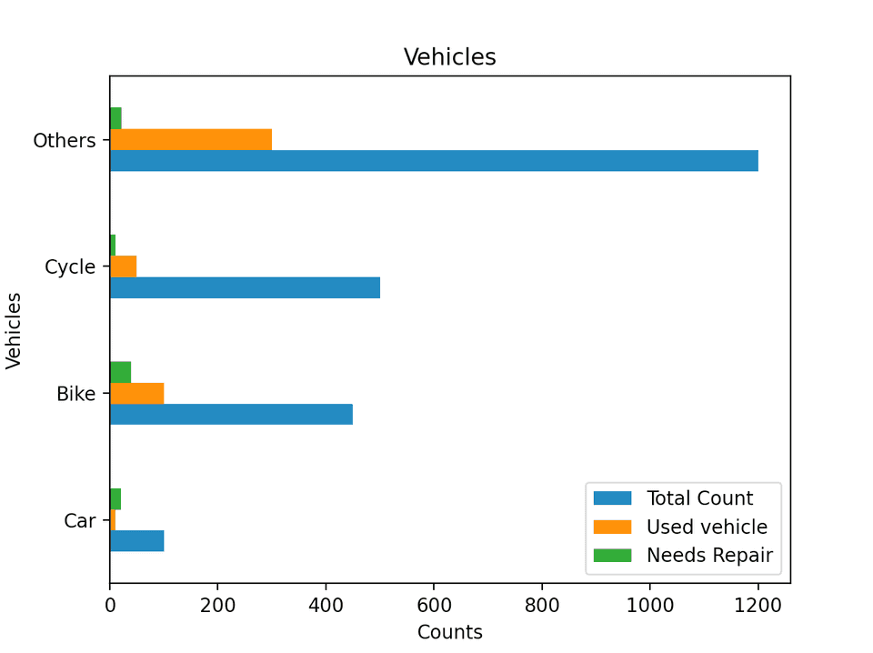
pandas makes it easy to create multiple bars for each category. Let’s say we want to show the total count for each vehicle category, count of used vehicles and count of vehicles those needs repair. We can plot these info as like below:
import matplotlib.pyplot as plt
import pandas

vehicles = ['Car', 'Bike', 'Cycle', 'Others']
vehicles_count = [100, 450, 500, 1200]
used_vehicles_count = [10, 100, 50, 300]
vehicles_needs_repair = [20, 40, 10, 22]

chart_data = {'Total Count': vehicles_count, 'Used vehicle': used_vehicles_count, 'Needs Repair': vehicles_needs_repair}

data_frame = pandas.DataFrame(
    chart_data, columns=['Total Count', 'Used vehicle', 'Needs Repair'], index=vehicles)

data_frame.plot.barh()

plt.ylabel('Vehicles')
plt.xlabel('Counts')
plt.title('Vehicles')
plt.show()
It will create the below histogram:
You can check the official documentation page to learn more about Matplotlib horizontal bar chart and other methods it provides.
You might also like:
- Python program to merge a dictionary to a tuple
- Python dictionary fromkeys method
- Python dictionary pop method explanation with examples
- 11 differences between Python 2 vs Python 3 with examples
- Learn Python numpy clip method with examples
- How to find Determinant in Python Numpy
- Get evenly spaced numbers in an interval using numpy linspace
- Python string isnumeric method
- How to use Python string partition method
- Python numpy floor_divide method explanation with examples
- How to use logical operator with strings in Python


