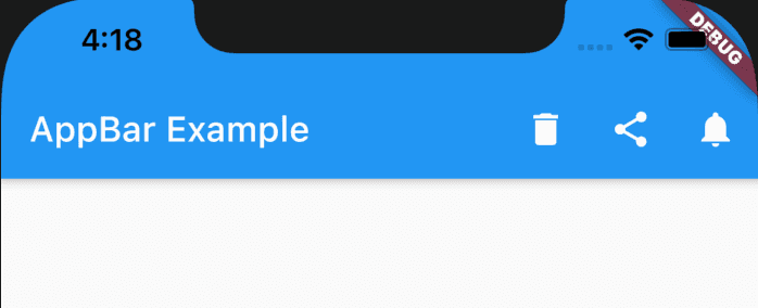
AppBar in mobile Applications:
AppBar is the topmost bar in mobile applications. It mainly include a title to describe the page we are currently on, leading button like a back button or a button to open the side navigation bar and actions buttons like delete, share etc.
It is easy to create an AppBar in Flutter Apps. Flutter provides a widget, AppBar class that we can use to create an AppBar.
In this post, we will learn how to use AppBar class with examples.
Example to create an AppBar:
Let’s take a look at the below example:
import 'package:flutter/material.dart';
void main() {
runApp(MyApp());
}
class MyApp extends StatelessWidget {
// This widget is the root of your application.
Widget build(BuildContext context) {
return MaterialApp(
title: 'Flutter Demo',
theme: ThemeData(
primarySwatch: Colors.blue,
),
home: MyHomePage(),
);
}
}
class MyHomePage extends StatelessWidget {
Widget build(BuildContext context) {
return Scaffold(
appBar: AppBar(title: const Text('AppBar Example'), actions: <Widget>[
IconButton(
icon: const Icon(Icons.delete),
tooltip: 'delete',
onPressed: () {},
),
IconButton(
icon: const Icon(Icons.share),
tooltip: 'share',
onPressed: () {},
),
IconButton(
icon: const Icon(Icons.notifications),
tooltip: 'notifications',
onPressed: () {},
)
]),
body: Center(child: const Text('Example of AppBar')));
}
}If you run this program, it will look as like below:
Here,
- AppBar is used to create an appbar widget.
- title is the title showing in the appbar
- actions is for a list of widgets to show after the title.
Other properties:
Following are the properties we can use with an AppBar:
- actions: It is a list of widgets to show after the title.
- actionsIconTheme: color, opacity and size to use for the icons.
- automaticallyImplyLeading → bool: try to imply the leading widget or not.
- backgroundColor → Color: AppBar’s color
- bottom → PreferredSizeWidget: widget appears across the bottom of the app bar
- bottomOpacity → double: opacity of the bottom of the appbar.
- brightness → Brightness: Brightness of the appbar
- centerTitle → bool: true will center the title
- elevation → double: Z-coordinate elevation of the app bar.
- excludeHeaderSemantics → bool: Boolean to define the title should be wrapped with header semantic or not.
- flexibleSpace → Widget: Widget stacked behind the toolbar
- iconTheme → IconThemeData: Color, opacity and size for the app bar icons.
- leading → Widget: Widget to show before the title
- leadingWidth → double: width of the leading widget.
- preferredSize → Size: Total height of toolbar height and bottom widget’s height
- primary → bool: Show the toolbar at the top of the screen or not.
- shadowColor → Color: Shadow color below the app bar.
- shape → ShapeBorder: shape of the appbar and its shadow.
- textTheme → TextTheme: Typography style for the app bar
- title → Widget: Primary title widget.
- titleSpacing → double: spacing around title content on horizontal axis.
- toolbarHeight → double: height of the toolbar
- toolbarOpacity → double: toolbar opacity
Example 2: Changing the color and adding a icon to the left:
We can change the color of the appbar and also add one icon to the left of the appbar as like below:
import 'package:flutter/material.dart';
void main() {
runApp(MyApp());
}
class MyApp extends StatelessWidget {
// This widget is the root of your application.
Widget build(BuildContext context) {
return MaterialApp(
title: 'Flutter Demo',
theme: ThemeData(
primarySwatch: Colors.blue,
),
home: MyHomePage(),
);
}
}
class MyHomePage extends StatelessWidget {
Widget build(BuildContext context) {
return Scaffold(
appBar: AppBar(
title: const Text('AppBar Example'),
backgroundColor: Colors.teal,
leading: IconButton(
icon: const Icon(Icons.menu),
tooltip: 'menu',
onPressed: () {},
),
actions: <Widget>[
IconButton(
icon: const Icon(Icons.delete),
tooltip: 'delete',
onPressed: () {},
),
IconButton(
icon: const Icon(Icons.share),
tooltip: 'share',
onPressed: () {},
)
]),
body: Center(child: const Text('Example of AppBar')));
}
}It will give the below output:

You might also like:
- TextField widget example in flutter and its different properties
- How to get user input text from a TextField in Flutter
- How to customize the textfield cursor in Flutter
- Flutter TextField how to change the maximum and minimum lines
- How to remove the debug banner in Flutter apps in development mode
- Changing the size of a floating action button in Flutter

