Introduction :
In this tutorial, we will learn how to create one rounded corner button in React Native.
How to do that :
To start with the tutorial, create one react native project using npx react-native init SampleApp.
Edit your App.js file as like below :
import React from "react";
import { SafeAreaView, StatusBar, StyleSheet, View } from "react-native";

const App = () => {
  return (
    <>
      <StatusBar barStyle="dark-content" />
      <SafeAreaView>
        <View style={styles.container}></View>
      </SafeAreaView>
    </>
  );
};

const styles = StyleSheet.create({
  container: {
    alignItems: "center",
    justifyContent: "center",
  },
  textInput: {
    width: "90%",
    height: 50,
    borderColor: "black",
    borderWidth: 2,
  },
});

export default App;
It will create one empty View.
Next, we will add one button with some styles to it to make its corners rounded:
Add one rounded corner Button :
React native Button component is used to add one Button. But we can’t use it to create one rounded corner button. Buttons are different in Android and iOS. So, react-native doesn’t provide this option to change the corner.
Instead, we can create one TouchableOpacity with a Text in it to make it looks like a button.
- Import TouchableOpacity and Text from react-native.
- Add the below code inside the container view :
<TouchableOpacity onPress={onPress} style={styles.button}>
  <Text style={styles.buttonText}>Click Me</Text>
</TouchableOpacity>
It will call the onPress function on button click.
- Add the below styles :
button: {
    backgroundColor: "gray",
    padding: 20,
    borderRadius: 10
},
buttonText: {
    color: "white"
}
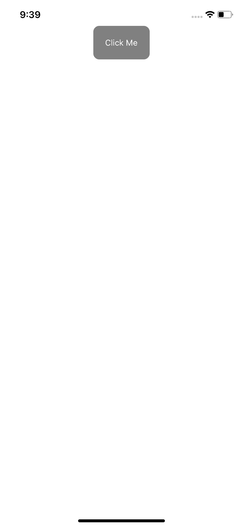
It will create one rounded corner button as like below :
Complete example :
import React from "react";
import {
  SafeAreaView,
  StatusBar,
  StyleSheet,
  View,
  Text,
  TouchableOpacity,
} from "react-native";
const onPress = () => {};
const App = () => {
  return (
    <>
      <StatusBar barStyle="dark-content" />
      <SafeAreaView>
        <View style={styles.container}>
          <TouchableOpacity onPress={onPress} style={styles.button}>
            <Text style={styles.buttonText}>Click Me</Text>
          </TouchableOpacity>
        </View>
      </SafeAreaView>
    </>
  );
};

const styles = StyleSheet.create({
  container: {
    alignItems: "center",
    justifyContent: "center",
  },
  textInput: {
    width: "90%",
    height: 50,
    borderColor: "black",
    borderWidth: 2,
  },
  button: {
    backgroundColor: "gray",
    padding: 20,
    borderRadius: 10,
  },
  buttonText: {
    color: "white",
  },
});

export default App;
You might also like:
- React Navigation part 3: program to move between screens using react navigation
- React Navigation part 4: React native program to pass data between screens
- React Navigation part 5: How to update params of a screen
- React Navigation part 6: How to set and change the header title
- React navigation tutorial 7: How to add header and header text color, font etc.


