Introduction :
React native button component is used to show one button on both Android and iOS. If you have worked on Android and iOS projects before, you must be aware of the fact that button looks different on both platforms. React native provides a couple of customization props that we can use to customize a button.
In this tutorial, we will learn how to create one button and how to customize it using props. If you want more customization, you can use other view like components TouchableOpacity or TouchableNativeFeedback.
Button props :
onPress :
function type. It is called when the user taps on a button.
title :
Text to display in the button.
accessibilityLabel :
Used to show text for blindness accessibility features.
color :
This is used to add color to a button. On iOS, it will color the text of the button and on Android, it will color the background of the button.
disabled :
This is a boolean value. It is used to enable/disable a button.
testID :
Id used to locate a view.
hasTVPreferredFocus :
Used for apple TV preferred focus.
nextFocusDown :
For android, it designates the next view to receive focus when navigates down.
nextFocusForward :
For android, it designates the next view to receive focus when navigates forward.
nextFocusLeft, nextFocusRight, nextFocusUp :
For android, it designates the next view to receive focus when navigates left, right, up.
touchSoundDisabled :
Used for android to enable/disable system sound on touch.
Example :
Create one sample React native project and change your App.js file as below :
import React from 'react';
import {
  SafeAreaView,
  StatusBar,
  StyleSheet,
  View,
  Button,
  Alert,
} from 'react-native';

const App = () => {
  return (
    <>
      <StatusBar barStyle="dark-content" />
      <SafeAreaView style={styles.container}>
        <View style={styles.parent}>
          <View style={styles.button}>
            <Button title="Click Me" onPress={() => Alert.alert('Hello')} />
          </View>
          <View style={styles.button}>
            <Button
              title="Click Me"
              color="red"
              onPress={() => Alert.alert('Hello')}
            />
          </View>
          <View style={styles.button}>
            <Button
              title="Click Me"
              disabled={true}
              onPress={() => Alert.alert('Hello')}
            />
          </View>
        </View>
      </SafeAreaView>
    </>
  );
};

const styles = StyleSheet.create({
  container: {
    flex: 1,
  },
  parent: {
    flex: 1,
    justifyContent: 'center',
  },
  button: {
    margin: 20,
  },
});

export default App;
Explanation :
-
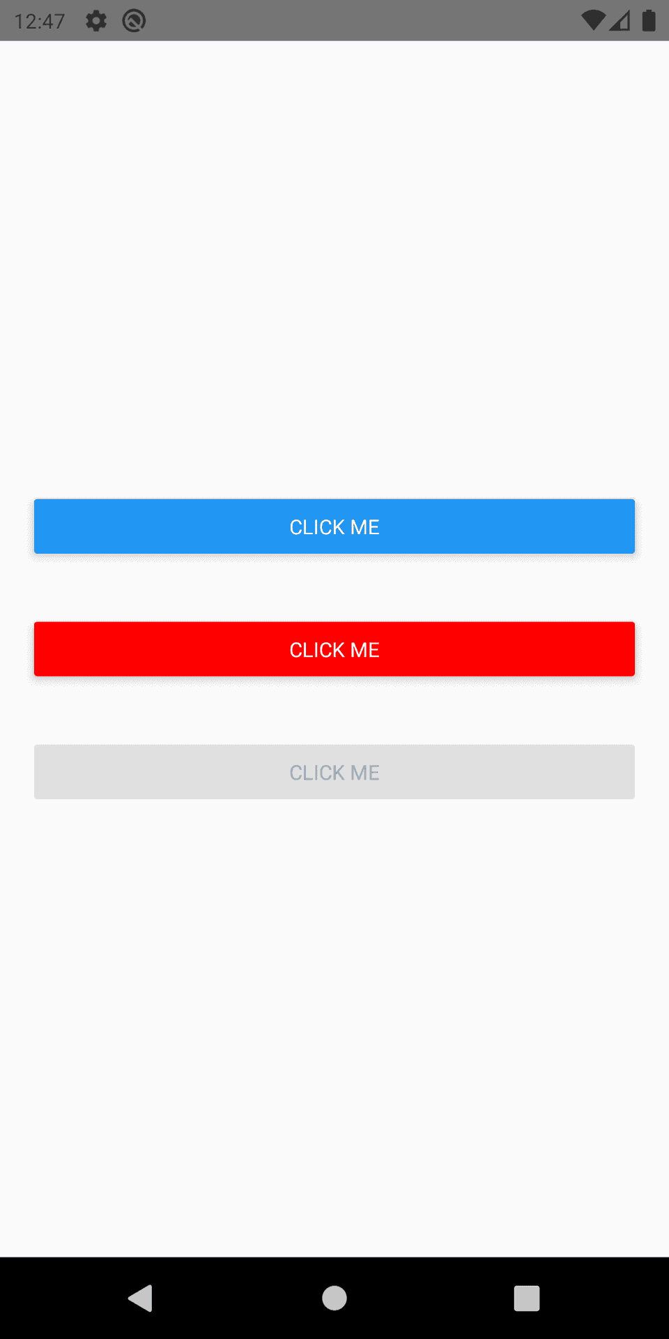
We have three buttons here.
-
All buttons have the same title and onPress. It shows one Alert if you press.
-
The second button has color red and the third button has disabled true. We can’t click on the third button.
If you run this program, it will produce the below output on Android :
And, similarly, on iOS, it looks as like below :
As you can see here, it looks different on iOS. But this is what is expected. iOS system buttons are different than Android. If you want more customization, you can use TouchableOpacity or TouchableNativeFeedback.


