Introduction :
ActivityIndicator is used to show a circular progress loader. For example, if you are downloading something from the internet and you want to show a progress indicator to the user, you can use ActivityIndicator. This component is easy to use and with a few customizable properties.
In this post, I will show you how to use ActivityIndicator with an example.
Props :
Following are the props that are available for ActivityIndicator :
1. animating :
It takes one boolean value, true by default. If true, it shows the indicator. Else it hides it.
2. color :
This is the color of the spinner. The default is gray on iOS and cyan on Android.
3. hidesWhenStopped :
This is available for iOS. It defines whether the indicator should hide if it is not animating. It is true by default.
4. size :
This is the size of the spinner. It can take small, large or any number value. Number is supported only on Android.
That’s it. We can use these props to change the behaviour of an ActivityIndicator. Let’s move to the example :
Example of ActivityIndicator :
Create one sample React Native project and edit the App.js file to add spinner indicators :
import React from 'react';
import {
  SafeAreaView,
  StatusBar,
  StyleSheet,
  View,
  ActivityIndicator,
} from 'react-native';

const App = () => {
  return (
    <>
      <StatusBar barStyle="dark-content" />
      <SafeAreaView>
        <View style={styles.container}>
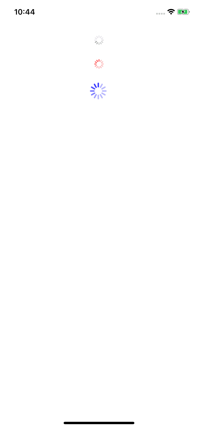
          <ActivityIndicator style={styles.indicator} />
          <ActivityIndicator color="red" style={styles.indicator} />
          <ActivityIndicator
            color="blue"
            size="large"
            style={styles.indicator}
          />
        </View>
      </SafeAreaView>
    </>
  );
};

const styles = StyleSheet.create({
  container: {
    alignItems: 'center',
    justifyContent: 'center',
  },
  indicator: {
    marginTop: 30,
  },
});

export default App;
It gives the below output on an iOS simulator :


