How to create a custom progress button in React Native with TypeScript:
In this post, I will show you how to create a custom progress button in React Native using TypeScript. We will create a button component that will take different props to customize its style.
props of the button:
The following interface will be used as the button props:
interface LoadingButtonProps {
  backgroundColorDefault: string;
  backgroundColorLoading: string;
  isLoading: boolean;
  indicatorColor: string;
  indicatorSize: number | "small" | "large" | undefined;
  textColorDefault: string;
  textColorLoading: string;
  text: string;
  textLoading: string;
  fontSize: number;
  width: number;
  height: number;
  borderRadius: number;
  onPress: () => void;
}
Here,
backgroundColorDefaultis the default color for the button.backgroundColorLoadingis the color of the button on the loading state.isLoadingdefines the current state.indicatorColoris the color of the activity indicator.indicatorSizeis the size of the activity indicator.textColorDefaultis the default font color.textColorLoadingis the font color when the button is loading.textis the default text.textLoadingis the text to show on loading.fontSizeis the font size.widthis the width of the button.heightis the height of the button.borderRadiusis the border radius of the button.onPressis a callback method to invoke when user taps on the button.
Button component:
Let’s create one new component LoadingButton.tsx with the following code:
import React from "react";
import { Pressable, View, Text, ActivityIndicator } from "react-native";

interface LoadingButtonProps {
  backgroundColorDefault: string;
  backgroundColorLoading: string;
  isLoading: boolean;
  indicatorColor: string;
  indicatorSize: number | "small" | "large" | undefined;
  textColorDefault: string;
  textColorLoading: string;
  text: string;
  textLoading: string;
  fontSize: number;
  width: number;
  height: number;
  borderRadius: number;
  onPress: () => void;
}

const LoadingButton = (props: LoadingButtonProps) => {
  return (
    <Pressable onPress={props.onPress}>
      <View
        style={{
          backgroundColor: props.isLoading
            ? props.backgroundColorLoading
            : props.backgroundColorDefault,
          width: props.width,
          height: props.height,
          borderRadius: props.borderRadius,
          alignItems: "center",
          justifyContent: "center",
          flexDirection: "row",
        }}
      >
        {props.isLoading && (
          <ActivityIndicator
            size={props.indicatorSize}
            style={{ paddingEnd: 10 }}
            color={props.indicatorColor}
          />
        )}
        <Text
          style={{
            color: props.isLoading
              ? props.textColorLoading
              : props.textColorDefault,
            fontSize: props.fontSize,
          }}
        >
          {props.isLoading ? props.textLoading : props.text}
        </Text>
      </View>
    </Pressable>
  );
};

export default LoadingButton;
This is the loading button.
- It uses a
Pressableas its parent component. - The visibility of the
ActivityIndicatoris controlled by theisLoadingvalue of theprops. Other styles are added as defined by thepropsto the components.
App.tsx file changes:
We can use the above component in any other component. For example, the following code uses the LoadingButton component:
import React, { useState } from "react";
import { SafeAreaView, StyleSheet } from "react-native";
import LoadingButton from "./LoadingButton";
const App = () => {
const [loading, setLoading] = useState(false);
const onPressButton = () => {
setLoading(!loading);
};
return (
<SafeAreaView style={styles.container}>
<LoadingButton
backgroundColorDefault="#6750A4"
backgroundColorLoading="#79747E"
isLoading={loading}
indicatorColor="white"
indicatorSize={26}
textColorDefault="white"
textColorLoading="white"
text="Download"
textLoading="Downloading.."
fontSize={20}
width={300}
height={60}
borderRadius={10}
onPress={onPressButton}
/>
</SafeAreaView>
);
};
const styles = StyleSheet.create({
container: {
flex: 1,
alignItems: "center",
justifyContent: "center",
},
});
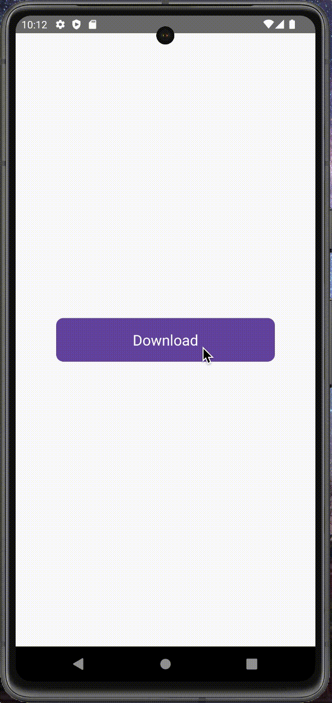
export default App;Output:
The state of the button is changed on clicking on it. If you run it on Android device, it will look as below:
You might also like:
- 3 ways to create platform-specific designs in React Native
- How to change the text size of TextInput in React Native
- How to hide the keyboard in React Native on tapping outside of TextInput
- 3 ways to detect if Keyboard is opened or closed in React Native
- How to hide the keyboard on scrolling through a FlatList in React Native